Apoplectic
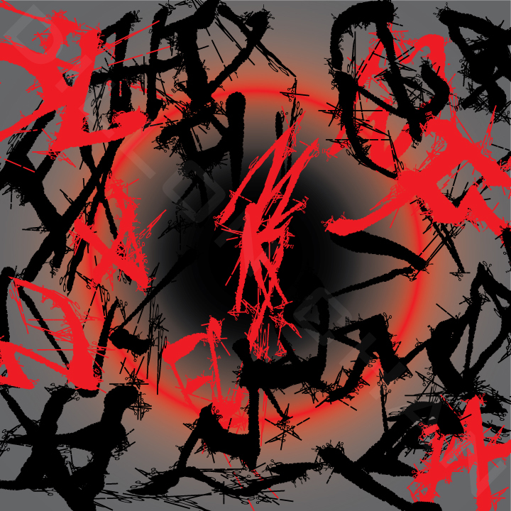
This piece was successful because it conveys the word "apoplectic" easily. The contrast between the colors of red and black help convey the mood. The red shape in the middle and the background creates a central focal point.
While creating this piece, I took the 'chiller' font, and put a stroke on it. The first stroke I put on was a dotted cut line, complete with little scissors. I tried a few other strokes, but none of them could compare to the cut line. Then I picked red because it often represents anger, and black, because it contrasted well with the red. The creation of this piece revolved around the stroke and color.
While creating this piece, I took the 'chiller' font, and put a stroke on it. The first stroke I put on was a dotted cut line, complete with little scissors. I tried a few other strokes, but none of them could compare to the cut line. Then I picked red because it often represents anger, and black, because it contrasted well with the red. The creation of this piece revolved around the stroke and color.
I Eat vampires for breakfast

This piece was successful because it shows the subject well, while still being in the flavor of the font, 'Gothic E'. The font is gothic, as the name implies, and I thought that "what's more gothic than vampire hunters?" My answer was "nothing", so that became my subject. The stroke was a sort of charcoal line, and it was fitting for the gothic theme the font gave me, so I used it on all of the letterforms.
Hardmixer
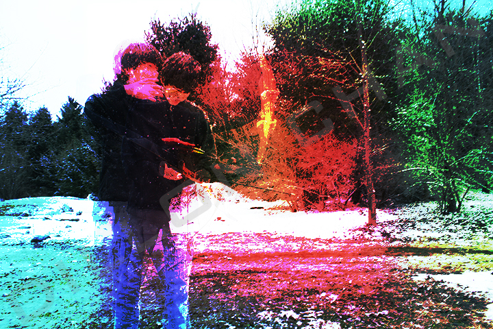
The success of this piece comes from the subject being shown moving within the frame. My first thought towards creating a multiple exposure type image was to do something I hadn't seen in the examples. I enjoy archery, and my subject also enjoys archery, and I hadn't seen any archery examples. And thus, I chose an archer as my subject.
While I was putting all of the frames together into the same image, I put a few gradients on as an overlay, and eventually wanted to have some fun and see what a hard mixed overlay would look like, except it turned out to be magnificent. I adjusted it more carefully and decided that there was nothing left to do on that piece.
While I was putting all of the frames together into the same image, I put a few gradients on as an overlay, and eventually wanted to have some fun and see what a hard mixed overlay would look like, except it turned out to be magnificent. I adjusted it more carefully and decided that there was nothing left to do on that piece.
Late nights
    |
This piece is successful in that it conveys the message of what having large amounts of homework can do to students, especially at the high school and college levels. The first image is vertical because the desk, the monitor and the papers create several vertical lines to follow through the piece. The second and third images show the homework across the desk. The third image has a bit of a spiral flow that draws eyes down and across, and the contrast of the brown book creates a focal point to help draw eyes in on it.
I created this series because the subject is something I can relate to and the medium is something I enjoy working with. |
